
Tattoo Motifs That Age Well: First-Timer Guide
Tattoo motifs that age well share line weight, spacing, and placement rules. Compare first-timer choices, fade risks, and AI squint tests.
Most first-timer advice stops at “pick something meaningful.” That is fine emotional guidance and useless technical guidance. The tattoo you get at 22 has to survive the skin you will have at 42 — and skin is not paper. It stretches, thins, and reprocesses ink for the rest of your life. So the real question is not “what looks good today” but “what still reads in two decades.” If you want a first tattoo that ages well, the best first tattoo designs are not the tiniest or trendiest ones; they are the ones with enough structure to stay readable as the ink settles. This guide answers that with the numbers artists actually use.
The one rule nobody tells first-timers: lines double
Here is the single most useful fact for choosing a motif. As tattoo artist Kyle Shri puts it, you can expect any line in a tattoo to roughly double in width over its lifetime. Ink sits in the dermis, and your immune system’s macrophages slowly reprocess and spread the pigment — a mechanism confirmed by a 2018 Journal of Experimental Medicine study on macrophage handoff. That doubling is not a defect; it is biology on a living canvas.
Everything about motif selection follows from that. If two lines in your design sit closer together than roughly twice their current width, they will eventually merge into a blob. A dense micro-portrait crammed into a 4 cm circle has almost no spacing budget — it is engineered to fail. A bold compass with generous negative space has margin to spare. This is why the “squint test” works: step back, blur your eyes, and if the major shapes still read, the motif will age. If it dissolves into mush when you squint, so will your tattoo.
Motif longevity, ranked
Style debates (“fine line vs bold”) miss the point. Two fine-line pieces can age completely differently depending on spacing and subject. What matters is line weight, detail density, and how forgiving the subject is. Here is how common first-tattoo motifs actually hold up.
| Motif | Typical line weight | Readable at 20 yrs? | Touch-up cadence |
|---|---|---|---|
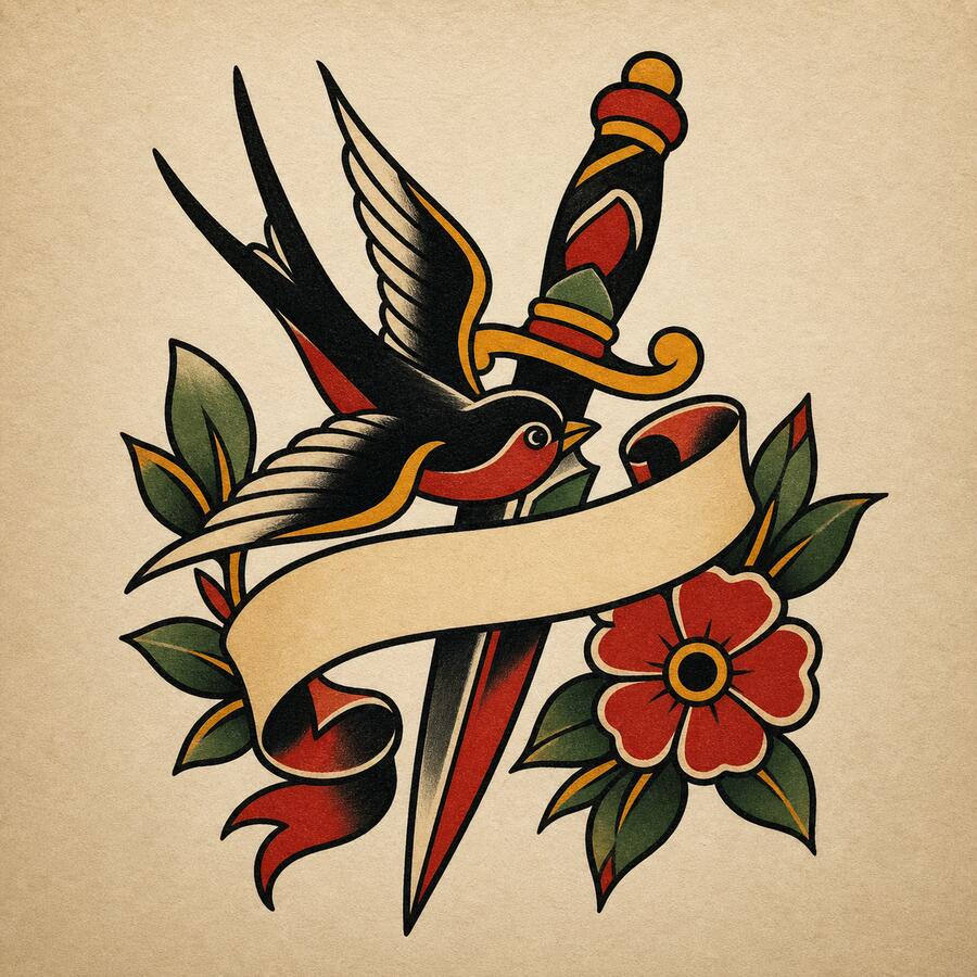
| American traditional (rose, anchor, eagle) | 3–8 mm bold | Excellent | Rarely, decades |
| Blackwork silhouette / geometric animal | 2–5 mm | Excellent | 10–15 yrs |
| Negative-space design (mountain, sun, wave) | Bold + open skin | Very good | 10 yrs |
| Roman numerals / single word | Medium | Good | 8–12 yrs |
| Botanical fine line (spaced) | 1–2 mm | Fair with care | 3–5 yrs |
| Micro-realism portrait | Sub-1 mm detail | Poor | 3 yrs, ongoing |
| Ultra-thin script / full quote | Hairline | Poor | 2–3 yrs |
| Watercolor (no black anchor) | Soft, no outline | Poor | Frequent |
The pattern is consistent across professional artists: bold structure and negative space age; packed micro-detail does not. Naama Studios openly flags ultra-fine and watercolor work as the styles they most often end up removing. That does not make delicate work forbidden — it makes it high-maintenance, which is exactly the wrong trade for a first tattoo. No tattoo truly stays unchanged, but tattoos that don’t fade quickly usually have a black anchor, open spacing, and a placement you can protect from sun and friction.
Subject matters as much as style
Aging is not only physical. A motif can hold its lines perfectly and still feel wrong because the idea dated. First-timers underestimate this. A few durable patterns from artists who have watched their own work walk back through the door a decade later:
- Roman numerals outlast Arabic numerals as a format — cleaner geometry, and dates never change meaning.
- A single word outlasts a full quote. The classic regret is text that captured one life moment and no longer fits.
- Symbols beat trends. A geometric wolf, a compass, a Japanese wave, a mountain range — these have been tattooed for a century because their meaning is stable and their shapes are strong.
- Pick one lane: pretty or meaningful. Mixing them (“meaningful because it’s also pretty”) is where the meaning slips while the prettiness turns generic.
Placement is a multiplier, not a footnote
Where you put a motif changes how long it survives — sometimes more than the design itself. High-friction, high-sun zones accelerate the line-doubling problem. If your heart is set on a delicate placement, the fix is simple: go slightly thicker on the linework and budget for touch-ups.
| Placement | Longevity | Why |
|---|---|---|
| Upper arm / shoulder | ★★★★★ | Low friction, low sun |
| Upper back | ★★★★★ | Stable skin, rarely stretched |
| Inner forearm | ★★★★ | Flat, easy to protect |
| Outer calf / thigh | ★★★★ | Thick skin, limited sun |
| Ankle / wrist | ★★ | Daily friction |
| Fingers / hands | ★ | Can blur within a year |
Sun exposure is the single most controllable external factor — daily SPF 30+ on healed ink dramatically slows fading. For a deeper breakdown, our tattoo placement guide maps pain, visibility, and aging by body zone.
What actually happens over 20 years
Knowing the timeline helps you set expectations and plan touch-ups instead of panicking at year ten. This is the consensus curve professional artists describe.
| Time | What typically happens |
|---|---|
| Year 0–1 | Ink settles; fine detail softens slightly; this is your baseline |
| Years 2–5 | Minor softening; reds and yellows lose a little brightness |
| Years 5–10 | Visible mellowing; fine lines widen; blacks stay strong |
| Years 10–20 | “Lived-in” look; black reads as charcoal grey; bold work still legible |
Notice what stays legible at every stage: bold work. That is the whole argument for a structural first tattoo in one row of a table.

Common first-timer mistakes
Straight from artists reacting to aged tattoos on Reddit and their own healed portfolios:
- Going too small. A 4 cm piece today is a soft 3 cm piece in 2040; a 1 cm piece is a smudge. Bigger holds more ink and ages slower.
- Chasing the Instagram render. Fresh-tattoo photos are the sharpest that ink will ever look. Ask any artist for healed photos — one-year and five-year — before you trust their fine-line work.
- Hands, fingers, neck as a first piece. The industry’s quiet rule: these are not first tattoos. They fade fastest.
- Skipping the consultation. A good artist pushes back — “too small to hold up,” “that font won’t read at this scale.” An artist who agrees with everything is a red flag.
The video below — a professional artist critiquing real aged tattoos submitted to Reddit — is the fastest way to calibrate your eye for what survives and what collapses.
Squint-test a motif before you commit — with AI
Here is a workflow that did not exist for previous generations of first-timers. Before you book a consultation, generate your motif at two line weights and run the squint test on the render, not on your skin.
With InkBolt’s AI tattoo generator, describe the same subject twice — once as a bold traditional version and once as a fine-line minimalist version — then compare. Blur your eyes at the two outputs. The bold render will keep its silhouette; the fine-line render often loses cohesion, which is a preview of how it will behave under decades of line-doubling. You are not committing to the AI art; you are using it to pressure-test the motif and weight before an artist ever touches you, and to hand your artist a clear reference. If you are still deciding between aesthetics, our choosing a tattoo style guide walks through matching style to subject and skin.
FAQ
Which tattoo motifs age the best? Bold American traditional, blackwork silhouettes, geometric animals, and negative-space designs (mountains, suns, waves). They rely on strong structure rather than packed micro-detail, so they stay readable as lines widen.
Do fine-line tattoos age badly? Not automatically. Fine line ages poorly when detail is packed into a small area or placed on high-friction skin. With intentional spacing, a protected placement, and touch-ups every 3–5 years, fine line can hold for decades.
How big should a first tattoo be to age well? Bigger than you think. Very small pieces have less ink and blur faster. If a design only works at thumbnail scale, size it up — a coin-on-forearm scale ages far better than a thumbnail-on-wrist.
What is the worst placement for a first tattoo? Fingers and hands — friction and constant washing can blur them within a year. Necks and feet are close behind. Start with the upper arm, forearm, or shoulder.
Should I get color or black for my first tattoo? Black ink is the most UV-stable and ages most predictably. Reds, yellows, and whites fade fastest. For a first piece that stays sharp, black or black-and-grey is the safest choice.
The through-line is simple: choose a motif with structure, give it room to breathe, put it on stable skin, and protect it from the sun. Do that, and your first tattoo will not just survive twenty years — it will look like you meant it.